You finally get a visitor on your website.
They read your content. They like your offer. They scroll down… reach your contact form… and then disappear.
No submission. No message.
If this feels familiar, you’re not alone. Form abandonment is one of the most frustrating problems website owners face in 2026. And most of the time, it’s not because users are lazy — it’s because something in the form makes them uncomfortable.
Let’s talk honestly about why real users abandon contact forms and what you can do to stop it.
1. The Form Feels Like Too Much Work
Be honest — would you fill out a long form just to ask a simple question?
The moment users see too many fields, they think:
“I’ll do this later.”
And later never comes.
What usually goes wrong:
-
Too many questions
-
Everything marked as required
-
No clear structure
How to fix it:
Keep your form short and friendly.
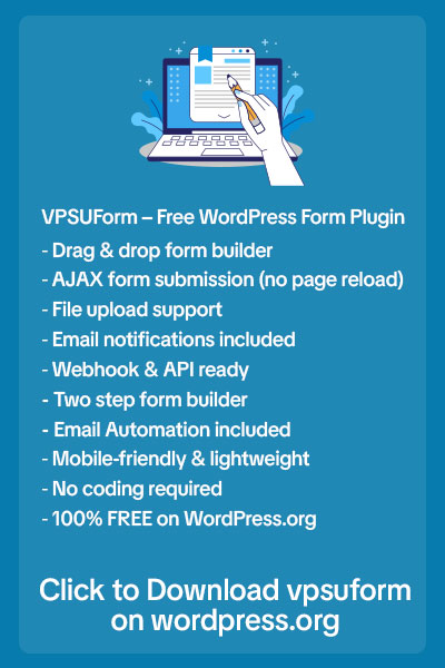
Ask only what you truly need to start the conversation. With VPSUForm, you can build clean forms that don’t overwhelm users the moment they land on them.
2. Users Don’t Trust What Will Happen Next
This is a big one.
Users often wonder:
-
Will my data be safe?
-
Will I get spammed?
-
Will anyone even reply?
If your form doesn’t answer these questions, users quietly leave.
How to fix it:
-
Add a short privacy note
-
Mention response time
-
Show a clear success message
Small reassurance builds big trust. VPSUForm helps you create forms that look professional and reliable — not suspicious or outdated.
3. The Form Is Annoying on Mobile
In 2026, most people visit websites from their phones.
If your form:
-
Requires zooming
-
Has tiny input boxes
-
Has buttons too close together
Users won’t struggle — they’ll leave.
How to fix it:
Design for thumbs, not mice.
VPSUForm forms are mobile-first by default, so users can submit forms comfortably from any device.
4. There’s No Clear Reason to Submit
Users always ask themselves one silent question:
“What do I get if I submit this?”
If the answer isn’t obvious, they won’t submit.
How to fix it:
Replace boring buttons like “Submit” with clear value:
-
“Get a free quote within 24 hours”
-
“Request a callback today”
-
“Send my inquiry”
Clear expectations increase confidence — and submissions.
5. The Form Feels Slow or Broken
Nothing kills trust faster than a form that:
-
Loads slowly
-
Shows errors
-
Feels unresponsive
Users assume your site isn’t reliable.
How to fix it:
Use a lightweight form plugin that doesn’t slow your website.
VPSUForm is built to stay fast and smooth, helping users complete forms without frustration.
6. Too Much Pressure, Too Soon
When every field is mandatory, users feel trapped.
They may want to ask a simple question — not commit to a long conversation.
How to fix it:
-
Make only critical fields required
-
Let users ease into the conversation
Less pressure leads to more trust.
The Real Truth About Form Abandonment
Most contact forms are designed for data collection, not for humans.
High-converting forms are:
-
Simple
-
Reassuring
-
Fast
-
Easy to use
How VPSUForm Helps You Keep Users From Leaving
VPSUForm is built with real users in mind:
-
Live preview while building
-
Clean and modern UI
-
Mobile-friendly layouts
-
Lightweight performance
-
Secure submissions
You don’t just get more clicks — you get more completed forms.
Final Thoughts
Users don’t abandon contact forms randomly. They leave because something feels confusing, heavy, or untrustworthy.
Fix the experience, and submissions will follow.
👉 Build human-friendly, high-converting forms with VPSUForm at vpsuform.info
Written for real WordPress site owners facing real conversion problems in 2026.