Take a look at your website analytics.
Chances are, more than half of your visitors are coming from mobile devices. Yet most contact forms are still designed as if everyone is sitting in front of a desktop computer.
This is why many website owners in 2026 face the same problem:
Mobile traffic is high, but form submissions are low.
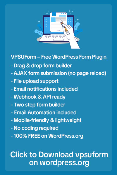
Let’s break down why most contact forms fail on mobile and how you can fix these issues to get more submissions using smarter form design with VPSUForm.
1. Forms Are Too Long for Small Screens
What feels “normal” on desktop feels exhausting on mobile.
When users open a long form on their phone, they immediately feel overwhelmed. Scrolling, typing, and switching between fields takes effort.
Why users leave:
-
Too many fields visible at once
-
Endless scrolling
-
No visual breaks
How to fix it:
-
Reduce the number of fields
-
Ask only essential questions
-
Group related inputs
Shorter, cleaner forms work better on mobile — and VPSUForm makes this easy.
2. Input Fields Are Hard to Tap
Mobile users rely on thumbs, not mouse pointers.
Common problems:
-
Small input boxes
-
Fields too close together
-
Buttons that are easy to mis-tap
One wrong tap is enough to frustrate users.
How to fix it:
-
Use larger input fields
-
Add enough spacing between elements
-
Make buttons easy to tap
VPSUForm uses mobile-friendly spacing and layouts by default.
3. Forms Aren’t Optimized for Mobile Keyboards
This is a silent conversion killer.
When users tap an email field and still get a normal keyboard instead of an email keyboard, it slows them down.
What goes wrong:
-
Incorrect input types
-
Extra typing effort
How to fix it:
-
Use correct field types (email, number, phone)
-
Reduce unnecessary typing
Good mobile forms feel effortless.
4. Buttons Are Hard to Find or Click
If users have to hunt for the submit button, they won’t bother.
Common issues:
-
Submit button below the screen
-
Poor contrast
-
Generic text like “Submit”
How to fix it:
-
Place the button where users naturally scroll
-
Use clear, visible styling
-
Replace “Submit” with value-driven text
Examples:
-
“Get a callback”
-
“Send my request”
-
“Get a free quote”
5. Forms Load Slowly on Mobile Networks
Mobile users are often on slower networks.
If your form:
-
Takes too long to load
-
Feels heavy
-
Freezes
Users leave instantly.
How to fix it:
-
Avoid heavy scripts
-
Use lightweight form plugins
VPSUForm is designed to stay fast and lightweight, even on mobile connections.
6. No Confirmation or Feedback After Submission
After tapping submit, users expect reassurance.
Without feedback, they wonder:
“Did it even work?”
How to fix it:
-
Show a clear success message
-
Confirm next steps
This small detail builds trust.
The Truth About Mobile Forms in 2026
Mobile users don’t lack intent — they lack patience.
If your form is slow, difficult, or uncomfortable to use, they won’t struggle. They’ll leave.
How VPSUForm Solves Mobile Form Problems
VPSUForm is built with mobile users in mind:
-
Responsive layouts
-
Touch-friendly fields
-
Lightweight performance
-
Clean, modern UI
-
Live preview while building
You don’t just get mobile traffic — you convert it.
Final Thoughts
If your contact forms don’t work on mobile, you’re losing leads every day.
Fix the mobile experience, and conversions will follow.
👉 Build mobile-friendly, high-converting forms with VPSUForm