You may have good traffic. You may even have a decent-looking website.
But if your contact form is poorly designed, you’re silently losing leads every single day.
In 2026, users are impatient, mobile-first, and highly selective. Even small form mistakes can push them away.
Let’s go through the most common contact form mistakes that cost you real leads — and how to fix them using smarter form practices with VPSUForm.
1. Asking for Too Much Information
This is the biggest mistake.
Long forms feel like work, especially for first-time visitors.
What goes wrong:
-
Too many fields
-
Personal questions too early
-
Everything marked as required
Why it costs leads:
Users don’t trust you yet. They leave instead of committing.
How to fix it:
Ask only what you need to start the conversation.
Short forms convert better — and VPSUForm makes it easy to keep things simple.
2. Using a Generic “Submit” Button
The word “Submit” doesn’t inspire action.
It feels cold, technical, and unclear.
Why it costs leads:
Users don’t know what happens next.
How to fix it:
Use value-driven button text:
-
“Get a free quote”
-
“Request a callback”
-
“Send my message”
Clear intent increases clicks.
3. Poor Mobile Experience
Most users fill out forms on their phones.
Common mobile mistakes:
-
Tiny input fields
-
Hard-to-tap buttons
-
Broken layouts
Why it costs leads:
Mobile users won’t struggle — they’ll leave.
How to fix it:
Use mobile-friendly, responsive forms.
VPSUForm is designed mobile-first, so forms work smoothly on any device.
4. No Trust Signals
Users hesitate when they don’t feel safe.
What’s missing:
-
Privacy message
-
Confirmation after submission
-
Professional design
Why it costs leads:
Uncertainty creates fear, and fear stops action.
How to fix it:
-
Add a short privacy note
-
Show a success message
-
Keep the design clean and modern
Trust increases submissions.
5. Forms That Load Slowly
Speed matters more than ever.
Why it costs leads:
Slow forms feel broken and unprofessional.
How to fix it:
-
Avoid heavy scripts
-
Use lightweight plugins
VPSUForm is optimized for speed, helping users submit without frustration.
6. No Clear Next Step After Submission
After clicking submit, users wonder:
“What happens now?”
Why it costs leads:
Uncertainty makes users lose confidence.
How to fix it:
-
Show a clear success message
-
Explain response time
Small clarity = big trust.
7. Not Tracking or Reviewing Submissions
Some site owners don’t even know if their form is working.
Why it costs leads:
-
Missed inquiries
-
Broken notifications
How to fix it:
Use a form solution that reliably stores and sends submissions.
VPSUForm ensures you never miss a lead.
The Bigger Problem: Forms Built Without Strategy
Most contact forms are added as a checkbox task.
But high-performing forms are:
-
Simple
-
Fast
-
Trustworthy
-
Easy to use
How VPSUForm Helps You Avoid These Mistakes
VPSUForm is built to solve real-world form issues:
-
Live preview while editing
-
Clean and modern UI
-
Mobile-first layouts
-
Lightweight performance
-
Secure submission handling
Less friction. More leads.
Final Thoughts
Contact form mistakes don’t look dramatic — but they quietly kill conversions.
Fix these small issues, and you’ll see a big improvement in lead quality and volume.
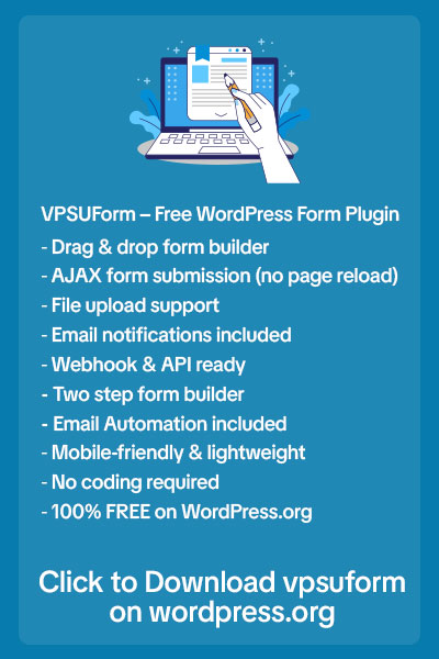
👉 Build smarter, high-converting forms with VPSUForm