Introduction
Let’s face it – most contact forms are boring.
If your form looks like everyone else’s, users will either ignore it or abandon it halfway. But with a few smart design tweaks, you can turn your forms into conversion magnets.
Today, you’ll discover 9 proven contact form design tips to make your forms not only look great but also feel trustworthy and easy to fill out.
1. Keep It Short and Sweet
💡 Why it works: The fewer the fields, the higher the conversion. Studies show reducing form fields from 11 to 4 can increase submissions by up to 160%.
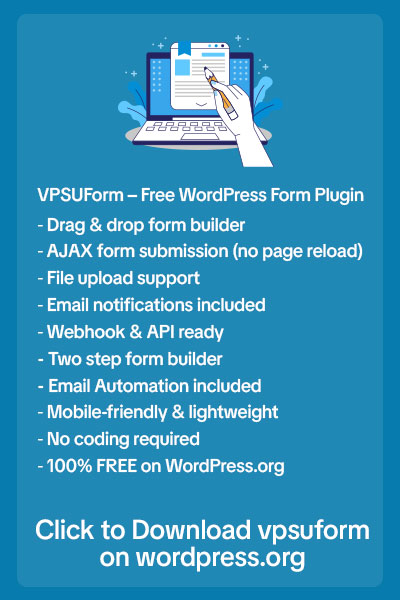
✅ Action: Ask only what you truly need. VPSUForm makes it easy to remove unnecessary fields.
2. Use a Single Column Layout
💡 Why it works: Multi-column forms confuse users and break natural reading flow.
✅ Action: Stick to a single vertical column for better readability and mobile responsiveness.
3. Add Clear and Friendly Labels
💡 Why it works: Labels clarify what’s expected and reduce form errors.
✅ Action: Instead of “Submit,” use “Send Your Message” or “Get Your Free Quote.”
4. Use Placeholder Text as Examples (Not Labels)
💡 Why it works: Placeholder text should guide users, not replace labels, to avoid confusion once they start typing.
✅ Action: Use placeholders for examples, like:
Email: example@yourdomain.com
5. Group Related Fields
💡 Why it works: Logical grouping makes long forms feel shorter and easier to scan.
✅ Action: For booking forms, group personal info, then service details, then payment info.
6. Design Visually Appealing Submit Buttons
💡 Why it works: A button that stands out guides users to take action.
✅ Action: Use a bright, brand-aligned colour with actionable text like “Book My Appointment” or “Start My Free Trial.”
7. Show Error Messages Clearly
💡 Why it works: Users get frustrated if they can’t figure out what’s wrong.
✅ Action: VPSUForm displays validation errors below fields. Customize messages to be friendly and helpful.
Example:
❌ “Invalid email”
✅ “Oops! Please enter a valid email so we can contact you.”
8. Make Your Form Mobile Friendly
💡 Why it works: Over 50% of users will view your form on mobile. Poor mobile design = lost leads.
✅ Action: VPSUForm forms are responsive by default. Test them on your phone to ensure buttons are large enough to tap easily.
9. Add a Success Message or Redirect
💡 Why it works: Users feel confident their submission was received.
✅ Action: Set a custom success message or redirect to a thank you page with VPSUForm to confirm and upsell your services.
Final Thoughts
Your form design directly affects your conversions. Even the smallest tweaks can result in more leads, more bookings, and happier visitors.
👉 Build beautiful, high-converting forms today with VPSUForm
👉 Explore more VPSUForm features here