Most people judge your business based on your website — often within 5 seconds.
A professional-looking website instantly builds trust, increases engagement, and boosts conversions.
The good news?
You don’t need a designer or a huge budget to make your website look clean, modern, and credible.
Here are simple, practical improvements anyone can apply to instantly upgrade their website’s look and feel.
1. Use Consistent Fonts and Colors
Inconsistent styling is the biggest giveaway of an amateur website.
Here’s what professionals do:
-
Use 2 fonts max — one for headings, one for regular text
-
Use 2–3 brand colors consistently
-
Avoid neon colors unless they’re part of your brand
-
Maintain similar sizes and line spacing on all pages
Tools that help:
-
Coolors (for color palette)
-
Google Fonts (free font library)
A small touch of consistency = a big boost in professionalism.
2. Keep Plenty of White Space
Crowded websites feel old and messy.
Modern websites breathe.
Add space between:
-
Sections
-
Headings
-
Form fields
-
Buttons
-
Images
White space improves focus, readability, and elegance.
Less clutter = more clarity.
3. Use High-Quality, Real Images
Users are tired of generic stock photos.
For better impact:
-
Use real photos of your product, office, or team
-
Use simple illustrations if photos aren’t available
-
Avoid pixelated or stretched images
Free high-quality sources:
-
Unsplash
-
Pexels
-
Freepik (for illustrations)
Authenticity always beats perfection.
4. Clean Up Your Navigation Menu
A professional site has a simple and logical navigation bar.
Follow the 5-link rule:
-
Home
-
Services
-
About
-
Blog
-
Contact
Anything more confuses visitors.
Drop the rest into a submenu if needed.
5. Add Professional Contact & CTA Sections
Your website should guide users through a journey.
Place clear CTAs like:
-
“Contact Us”
-
“Get a Free Quote”
-
“Try For Free”
-
“Download Guide”
And ensure your contact page includes:
-
A clean form
-
Email
-
Phone (optional)
-
Google Map (if applicable)
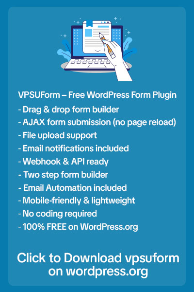
💡 With VPSUForm, you can build beautiful, minimal, and smart contact forms that instantly make your website feel premium.
6. Make Your Website Mobile-Responsive
More than 70% of users browse from mobile.
A site that breaks on mobile feels old and untrustworthy.
Check:
-
Are buttons clickable on small screens?
-
Do images fit properly?
-
Does text look too large or too small?
Test using:
-
Browser DevTools
-
Google Mobile-Friendly Test
A small fix here boosts both conversions and SEO.
7. Add Testimonials and Social Proof
People trust businesses recommended by others.
Show:
-
Customer reviews
-
User photos
-
Star ratings
-
Client logos
Even 3–4 honest testimonials massively increase credibility.
8. Fix Broken Links and Grammar
Nothing hurts professionalism more than:
-
Broken links
-
Spelling mistakes
-
Poor grammar
Use:
-
Grammarly (for writing)
-
Brokenlinkcheck.com (for links)
This small effort shows you care about quality.
9. Keep Sections Clean and Easy to Scan
Users don’t read — they scan.
Use:
-
Short paragraphs
-
Bullet points
-
Big headings
-
Simple icons
-
Highlighted text (bold/colored)
Make every section easy to understand in 10 seconds or less.
10. Use Smart Forms That Feel Modern
Old, bulky forms make your site look outdated.
Modern websites use:
-
Multi-step forms
-
Conditional logic
-
Clean design
-
Auto-replies
-
Progress bars
This is where VPSUForm gives your website an instant upgrade.
It makes your forms look sleek, interactive, and trustworthy — without needing a designer.
👉 Try VPSUForm today to turn boring forms into professional, high-converting experiences.
Final Thought
A professional website is not about fancy design —
It’s about clarity, consistency, and trust.
Your visitors should feel:
-
Safe
-
Guided
-
Informed
-
And impressed
Start applying even 3–4 of the tips above, and your website will look more premium, modern, and conversion-ready — instantly.