Every website owner wants more conversions.
More sales.
More signups.
More leads.
But most people think that conversions improve only when you spend money on ads or redesign your website completely.
Not true.
In reality — small improvements in the way users interact with your website can instantly increase conversions, trust, and engagement… without any paid marketing.
Here are 7 powerful and practical improvements you can apply today to make your website perform significantly better.
1) Remove confusion from your homepage (Clarity = Conversions)
Your homepage is the first impression — and users make judgment decisions in 3–5 seconds.
Ask yourself:
-
Is it clear what your site offers?
-
Is it clear who it is for?
-
Is it clear what the next step is?
If users need to figure out what your site does… most will bounce.
Action Tip:
Rewrite your hero section to ONE focused statement + CTA.
Example:
Build beautiful, smart forms in minutes — Start Free
Simple. Clear. Direct.
2) Put social proof where it actually matters
Don’t hide testimonials at the bottom of your page.
Use social proof ABOVE the fold — because trust must happen early.
Powerful forms of social proof:
-
Star ratings
-
Real user testimonials
-
Client logos
-
“X people currently using this” stats
-
Featured on / media mentions
Users trust users more than brands.
3) Make your website fast + lightweight
Speed is the silent conversion driver.
Slow pages destroy conversions before they even start.
-
Compress images
-
Use lazy load
-
Remove unused bloated plugins
-
Enable caching
-
Use optimized hosting
Even a 0.5s speed improvement gives better conversions and better SEO.
4) Keep one MAIN action everywhere
Many websites have 6 different CTAs (book demo, view pricing, free trial, read blog, learn more… etc)
This confuses the brain → confused brain says NO.
Choose ONE primary action site-wide.
Examples:
-
“Sign Up Free”
-
“Install Now”
-
“Start Building Today”
When users don’t have to think — they convert easier.
5) Use interactive forms instead of boring static forms
Forms are your final conversion gate.
If the form sucks → your conversion dies at the end.
Long forms scare users.
Irrelevant questions annoy users.
Static forms feel outdated.
Interactive forms solve this.
-
show only relevant fields
-
use conditional steps
-
make multi-step flow
-
reduce initial overwhelm
This improves both lead quality AND form submission rate.
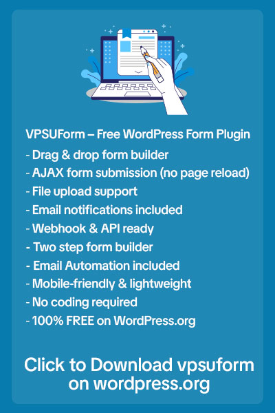
This is exactly where smarter form builders like VPSUForm help — because they let you build dynamic form experiences that react to user input instead of showing everything at once.
6) Add an exit intent offer (lead recovery trick)
Before users leave → give them a reason to stay.
Examples:
-
Free checklist
-
Discount
-
Free trial
-
Lead magnet
-
Case study PDF
-
Cheat sheet
Even a simple resource can recover 15–25% of lost traffic.
7) Watch real user behaviour (not assumptions)
Use heatmaps, scroll tracking, click recordings.
You will be shocked how differently users behave vs how you think they behave.
You will discover:
-
where they lose attention
-
which field makes them drop
-
what they ignore
-
what they click most
-
what they never see
When you improve based on DATA instead of guessing… conversions go up drastically.
Final Thoughts
The biggest growth breakthroughs do not come from rebuilding your website from scratch.
They come from improving what you already have.
Small UX improvements = Big revenue impact.
Apply these 7 improvements gradually — and your website will start converting smarter, faster and stronger.
Want to improve your form conversions instantly?
If you want to upgrade the most important conversion element on your website — your forms — then start using VPSUForm to create smart, dynamic and high-converting forms.
👉 Join VPSUForm Today: https://vpsuform.info/
Turn your forms into intelligent experience funnels — and watch your conversions grow.


